Our Rapid Prototyping Process with Android Automotive
Sep 21, 2022
Casper Kessels

Creating an infotainment system from scratch is a big challenge. One certainty is that you won’t get it right on the first try. As with any software development project, the real power lies in being able to iteratively build out the product through a close collaboration between designers and developers.
Having been involved in the car industry for some time, we have seen the challenges that large organizations face. Reaching across the silos between the different design disciplines, between design and development, and between different departments is difficult.
Ever since we started working on our own modular infotainment system, we have been optimizing our process. We’d like to share how we have been doing it and how Android Automotive is instrumental in that.
We focus on three things:
1. Rapid iterations
Designers sitting alone at their desks won’t come up with great designs. Only after seeing their designs in context and gathering user feedback does a design improve.
2. Prototyping directly in Android Automotive
You’d be surprised how quickly you can create a working prototype in Android. It has the added benefit that developers understand technical constraints much sooner in the process. We run Android Automotive with our own app store on Samsung tablets which means we can easily push prototypes to designers and developers.
3. Developers are also designers
User-centered design is not just something for designers, but for each member of the team. Developers don’t just execute but actively participate in the design process. Developers have a deep understanding of the technical side and come up with ideas that designers don’t even think about.
To put these principles into context, here is an abstract version of what our process looks like:

A perfect example of how we apply this is a recent project focused on sliders.
Sliders
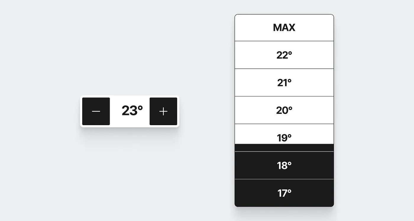
A while ago, we were thinking of ways to make frequent interactions, like changing temperature or volume, easier and safer on a touch screen. One idea was to use sliders instead of buttons. Instead of having to aim for a relatively small touch area, we can make use of Fitts’ law and place the control at the edge of the screen. The only movement detected by the system is the direction of the slider (either horizontal or vertical), which evens out forces in the other direction caused by driving.

An idea like that is great, but useless if not tested. On top of that, spending a great deal of time and energy testing such a broad assumption is not productive. So we take it one small step at a time. First, we created a minimal prototype to validate the core idea. All it takes for that is a designer and a developer working closely together.
At this stage, there is no point in making a detailed design. The designer delivers some basic low-fidelity wireframes and discusses the idea and open questions with the developer. Here is what that looked like:

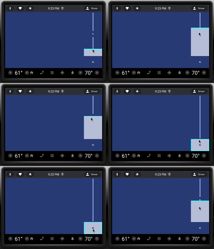
After giving input, the developer builds a simple Android app of the prototype. After pushing the prototype to our app store, the designer can download it on the tablet and start playing around with it. Despite being in two different locations, the designer and developer can collaborate closely.

The team discusses the results and another quick iteration follows to fix details like labels, sizing, and colors. Thanks to the tablet, it is easy to test this prototype at home, in a simulator, or in a car.

Within a week, we went from an abstract idea to a prototype running in Android Automotive. By being able to test the interactive prototype in Android, we got a real feel for how the interaction may work. On top of that, we gained an understanding of the technical limitations of building such a UI element in Jetpack Compose, and we laid the basis for the feature if we decide to build it.
—
Is this enough to decide to include this in our final product? No, but it is enough to decide whether to continue with this concept or not. Since the concept shows promise, it is now easy to add the prototype to our home screen and test it with people outside of this project and potential end-users.

Instead of spending weeks building a high-fidelity prototype in a test vehicle, we spend a week with two team members to explore the idea. We are not only following this process for this specific feature, but for our entire in-car software platform. We distilled the in-car infotainment down to the bare minimum and iteratively test and build out the system in these short cycles with the help of our tablets and development tools. Like this, we catch UX errors early, understand technical constraints, and greatly speed up our development time.
We will continue to share our progress and learnings on this blog so stay tuned for the next update!