Automotive companion apps — A missed opportunity
Aug 16, 2022
Juhani Lehtimäki

I think the car industry hasn’t yet realised the potential of what well designed companion apps can bring to car ecosystems. A companion app should not be an afterthought, or just a way to connect to the car, but it should be created from the start to facilitate all the interaction outside driving, thus connecting the car to your digital life and making the in-car experience better. There’s no infotainment without a companion app. Actually, I don’t like the term “companion app” as it indicates something that isn’t a unified part of the experience. Maybe we should simply call them “the car app”.

Photo by Sahej Brar on Unsplash
Traditionally, cars have been part of our life but not integrated into the rest of it. We have had different music in the car, different navigation, etc and the nearest we came to connecting into the rest of our life was a garage door opener.
Times have changed.
The way we interact with devices has changed.
The role of the car, as a device, is changing.
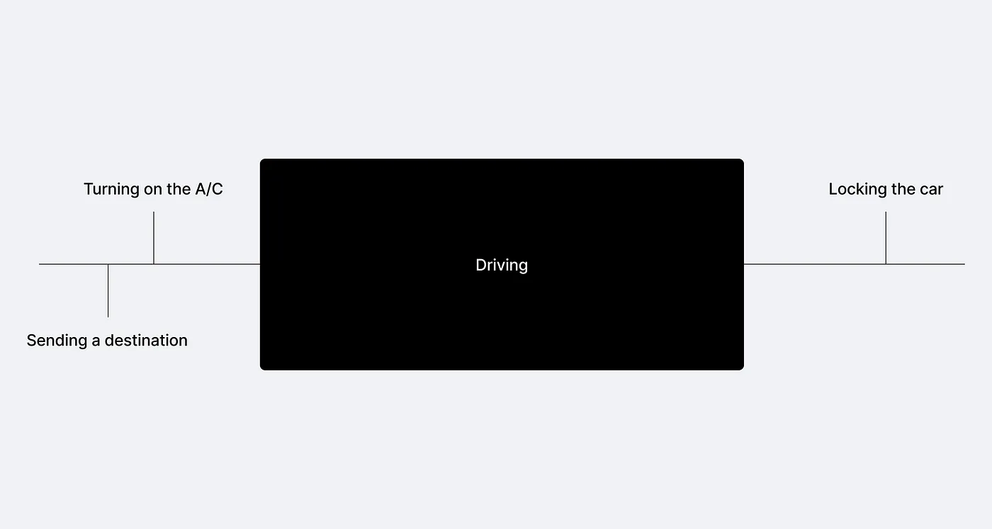
Here is what car companies think car ownership is:
What car ownership actually is, and much more:
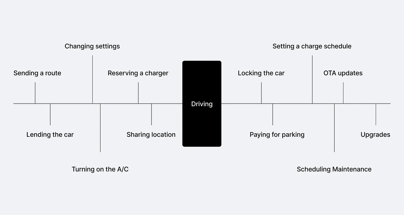
What does a future car app look like?
It’s time to start thinking about cars more as one device in the midst of many others your home has. It’s time to think of it like a smart speaker, smart TV, or a connected thermostat. The common thing with these devices is that they’re most useful when they integrate seamlessly into the rest of your life. Your thermostat knows when you’re home using your phone location to automatically adjust the temperature when needed. Your smart speaker and smart TV know to play music and TV shows you like from sources you like to play them from. So should your car.
Share the control responsibility
How do we control our smart home devices? Sometimes we use their in-built interface, sometimes we use voice controls, but most often we use the supercomputer we carry around in our pockets, our smart phone. Its direct touch interface and smooth interaction is very difficult to beat. If I want to program my thermostat, why should I stand in front of it to do that? Instead, I do it when I have a convenient moment, from wherever I happen to be using my phone. The device’s own physical interface is there for short, occasional tasks when I happen to be within a reach of it. Maybe I’ll check the room temperature, or maybe I’ll increase the temperature by 1 degree.
The same principle applies to cars and car interfaces. The in-car system is there to be used when it is convenient. But why would I be adjusting my car settings from it? Or why would I be browsing the app store locked into one seat, one location? I want to see what is available to be installed in my car when it is convenient for me, sitting on the couch when rocking the baby to sleep. The idea that I need to find a time to sit in my car, when it’s not moving, to set it up, add functionality, and learn to use it feels outdated. When I’m done with my trip in the car, I get out of it.
As a result, the in-car stuff can be much simpler to use (and build and update).
Example, installing apps
Apps are coming to cars. But I don’t want to sit in the car browsing what new apps there might be. Again, when I’m in the car, I’m driving. My car, a Polestar 2, was updated to a new software version about a month ago. But only very recently I had a chance to look into the new performance app that came with the update.
The Google Play Store experience is so close to being good with one glaring failure. If I want to install an app to the Polestar 2 AAOS infotainment system I have 3 options.
I can install it from the in-car Play Store app by searching for it, hitting install, done. But more interestingly I have 2 other options. I can install the app to my car using my phone or directly from the browser. The browser option is extremely useful (iOS users, you don’t know what you’re missing). If I’m browsing the web and run into an article talking about an app for my car, I can initialise the installation immediately and the app is there when I next time jump into my car.
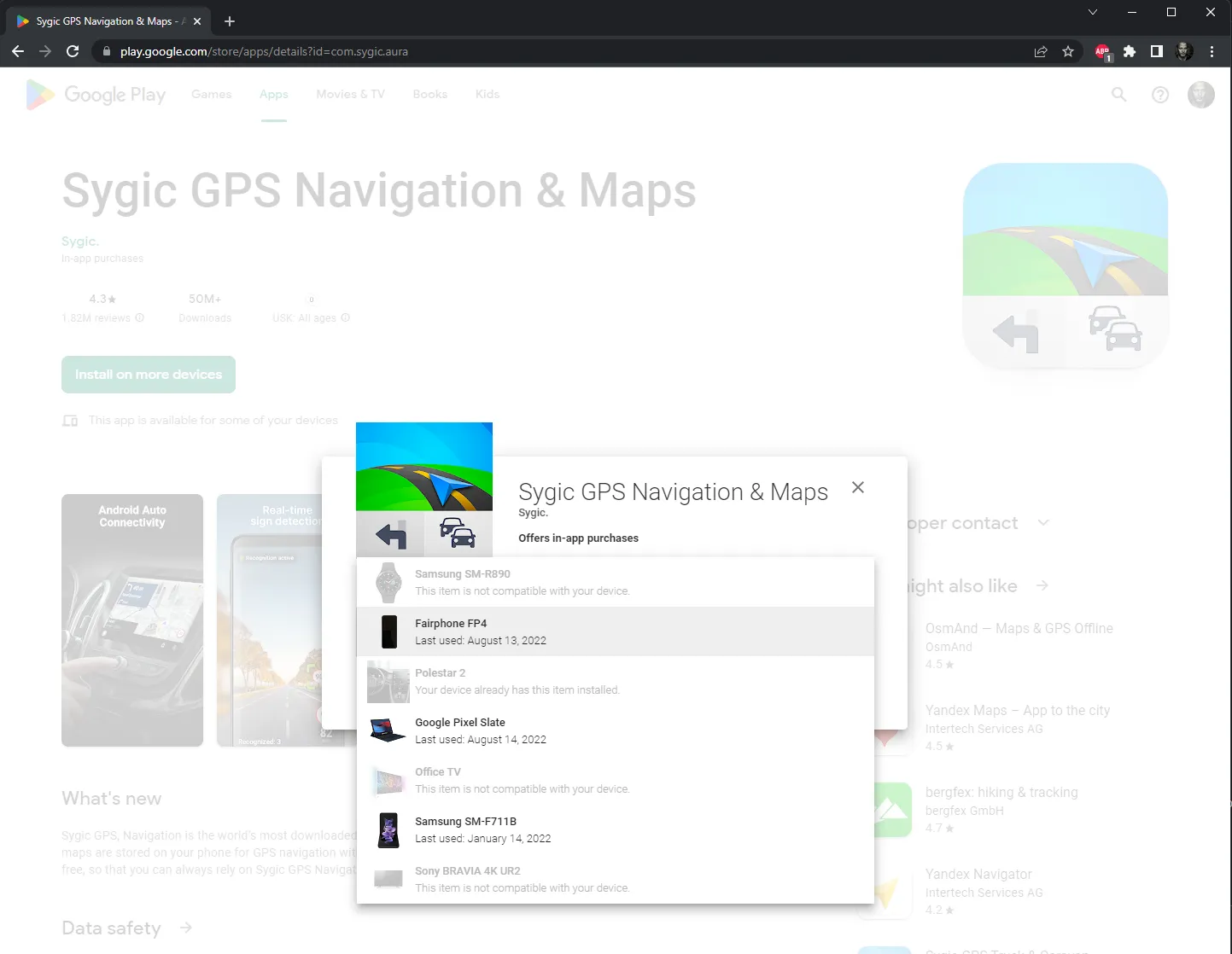
The problem with the Play Store is that there are too many apps and there’s no way to look into in-car apps only. So there is no discovery. The car app should take over from the Play Store and have a curated list of apps to help discovery. Garmin Connect IQ does this well for Garmin Smart Watches. I have a “Hot & Fresh Apps” list available to me, which I tend to view regularly. Car apps should do the same.

A car is a shared device, multiple users at the same time
And it’s not just one phone. It’s many phones. Even while in the car, the in-car screen might not be the most convenient way to control the infotainment. Think of a co-driver wanting to add a destination.
You’re probably familiar with this scenario: You’re driving somewhere and your co-driver asks if you could loop through a location they wanted to visit. So you ask them to add it to the navigation. The co-driver digs out their phone, finds the website of the place they wanted to visit and starts furiously typing the address, copying it from the screen into the in-car system. If all goes well, it’s not too painful but unpleasant. If there are mistakes, it becomes a bit more of a mess. Why do we still do it this way? The co-driver could just pull out their phone, share the location directly to the car app running on their phone in a co-driver mode without having to type in anything. The phone and the infotainment system seamlessly sync the new instructions and you’re off. And it even works when your co-driver is sitting in the back seat with the kids. The solution is not adding more and more expensive screens to the cars. It’s a better companion app.
Part of the ecosystems
Phone ecosystems are comprehensive, ever expanding and highly interconnected. Bringing the car into the context of the user’s life allows us to connect and benefit from all of it. Think beyond driving, think passion and understanding of what the user wants. Think proactive experiences.
Google Fit and Apple health or Google Home and Apple HomeKit are ecosystems of ecosystems. They’re built to connect devices and services to each other without each entity having to establish direct relationships. Bringing the car into these systems and alike allows you to get much more than you give. You implement one API and you’re connected to hundreds, or even thousands of other systems. Users can benefit from feeling that your car is now part of their life. The car no longer is used only when driving but also other times as part of the phone. You can bring your product in front and centre of new use cases.
Think about situations where the car can serve users better by knowing that they’ve just completed a 10k run in a 27C° heat or their current heart rate, for example. The opportunities are vast. We’re only scratching the surface of what is possible when we start to think outside the metal box.

Monetisation and owning the customer
Time after time, I hear the same fears form the automotive industry: “but we want to own our customers’’. I understand it, change is scary. The old business models worked in the old world. But this is the new world. The car industry can either adapt to the new world of smart phones as the centres of users’ lives or jam their fingers in their ears pretending that they still can “own the customer” alone. Once you let go of the hopeless desire to live in the past and start looking into what you can do in the new world you realise that it’s full of opportunities for players willing to adapt.
Think about the possibilities for benefiting from the much wider use context users’ phones have combined with all the in-car data of them. The information can be thoughtful and privacy-respecting ways mined to improve purchasing, driving and fan experiences.
And when it comes to monetisation, the options are much wider. You can think of ideas much beyond charging for subscription fees for heated seats. Build software that adds new value to the users without cutting existing functionality of the car. Multiple payment options are already set and ready to go for you and your ideas on the users’ phones.
The reality of technical challenges
Making two mobile devices talk to each other reliably is no easy task. Connectivity and battery issues alone can make developers’ hair grey. Any system like this has to be built extremely fault tolerant. Unreliable information is the name of the game. The UX of the system has to incorporate the idea that we might not be connected to the car all the time.
A good example is a recently added “your car is parked at” feature to the Polestar companion app. The car reports where it is parked whenever you stop and get out of the car.
A good idea in principle, other than my garage doesn’t have any network connectivity. So whenever I have my car parked at home, the companion app lies to me without any hint of low confidence of the data.
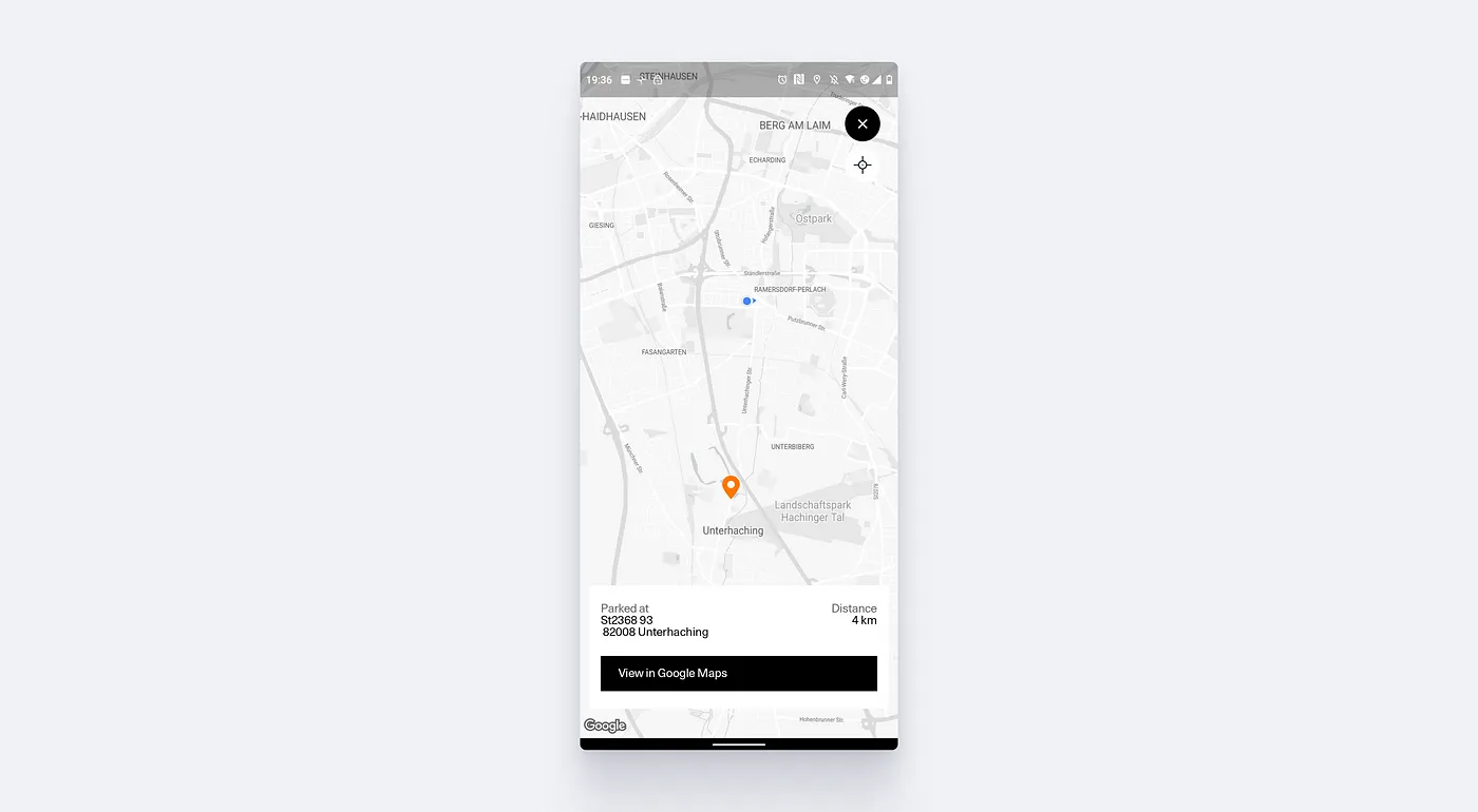
As mentioned, these systems must be designed technically, as well as from a UX perspective to deal with unreliable data and try to mitigate situations where false information is given to the user without indicating the confidence in the data.
The Polestar issue could be fixed with couple of possible ways:
At the very least, indicate when it is not possible to verify the parking location by pinging the car. Tell the user that the information might not be accurate.
Make a note when the car is moved again, invalidating the latest parking location. This way we’d avoid showing wrong data, we’d show “I don’t know” instead. Which would be better.
Track location more frequently. While this comes with its own technical challenges, we would have a location ping stored before the connection is lost. From that we could infer the general area of where the car is parked and give the user an indication.
Even better would be to utilise multiple ways of connection. My phone is connected to the car when it is parked. Why not fall back to Bluetooth to send the information to my phone while parking in non-network covered areas. The phone can transmit the location data once it regains connectivity.
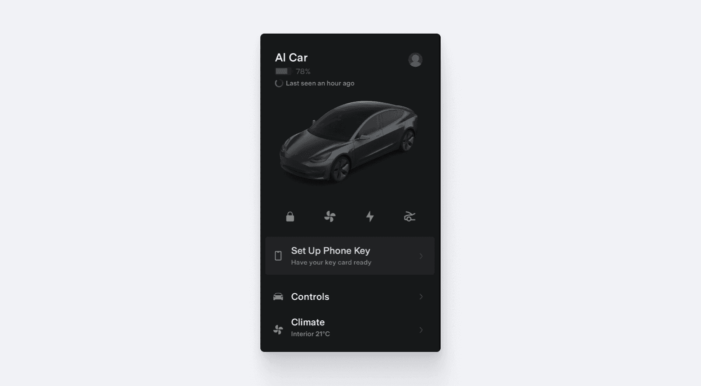
Tesla has done the bare minimum. We at Snapp Automotive believe that much better systems can be created. Tapping into the wealth of knowledge of our colleagues on the Snapp Mobile, mobile app agency, we’re working together building a unified, fault tolerant infotainment — car app combined system. We believe that car companies should be focusing on what matter, their customer, let us worry about the technical implementation.

Snapp Automotive system is designed to handle connectivity issues from the very beginning.
TL;DR
In-car systems and the connected apps form a unified whole that should be designed and built together. They share responsibilities and offer functions where it makes most sense, making both systems easier to use and simpler. A companion app is not an afterthought.